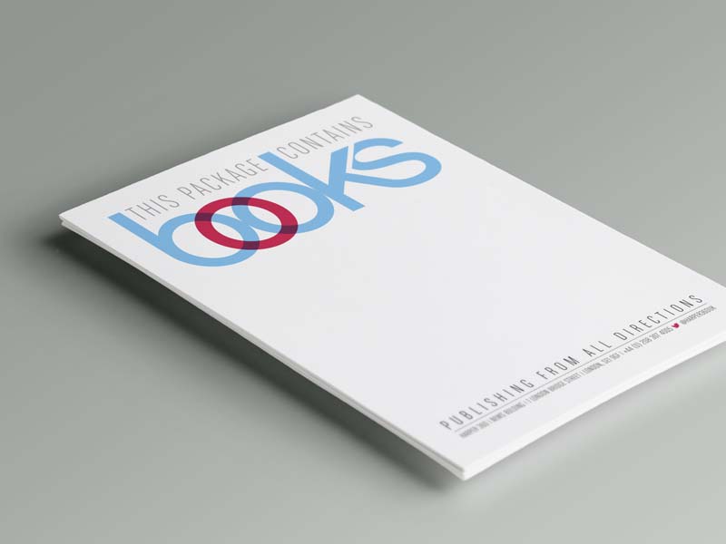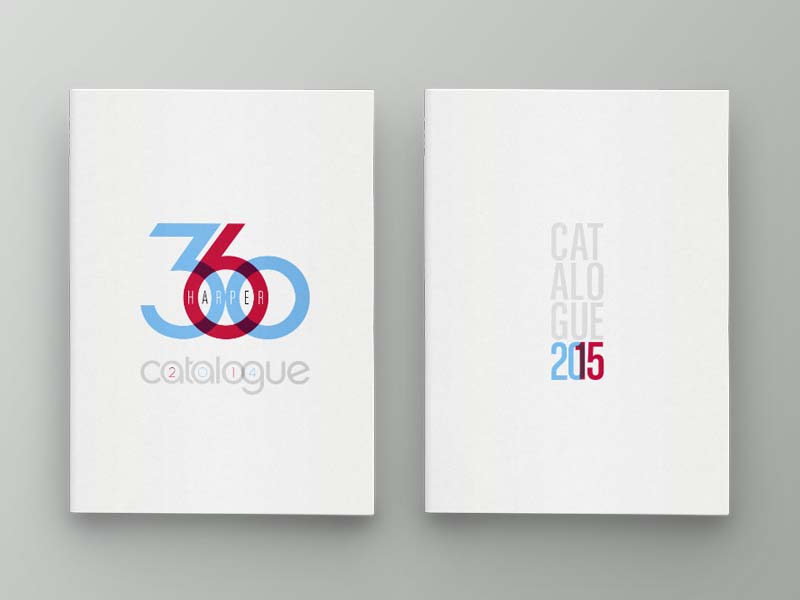
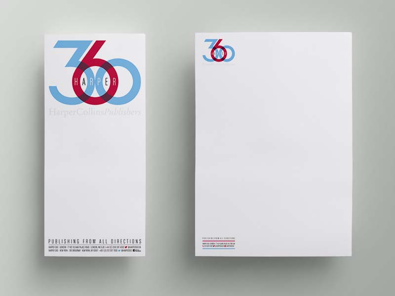
Harper 360 is right up there as an all-time favourite. A means of harnessing all rights to all HarperCollins authors around the world, the logo was originated in powerpoint. No more, no less. We thought they deserved better and so we produced a living, breathing logo capable of performing successfully across all markets and all countries.
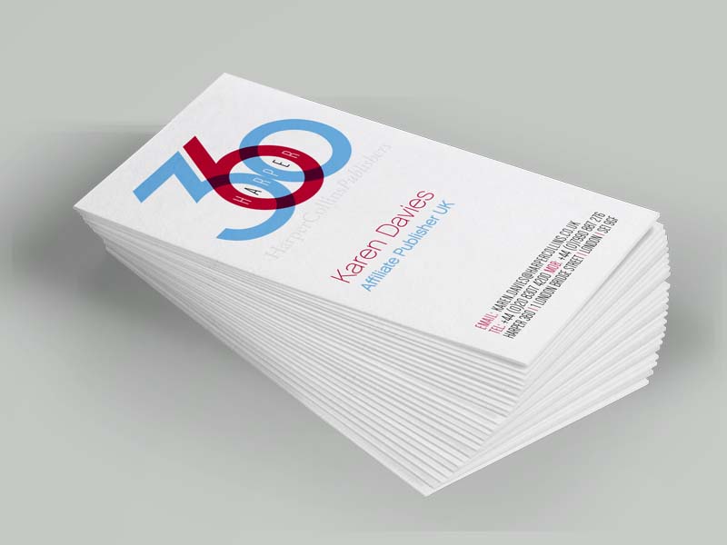
he numerals sit so beautifully together and when moved closer, become a link that emulates the ties between each of the global partners. The spacing provides perfect ‘accommodation’ for the word harper and the choice of softer colours reflects the traditional HarperCollins red and blue while being perceived as playful yet bold.
360 now sits proudly and recognisably within the HarperCollins portfolio as evidence of its global presence within the publishing world. The logo has transitioned from email footers to stationery, business cards, catalogues and biannual presentations, all the whole providing HC with a stronger voice and brand presence.